Thursday, 10 September 2015

FOUNDATION ART AND DESIGN -- GRAPHICS

GRAPHICS

Our assignment was to choose a word and design it or draw it onto an A3 piece of paper. When I looked at my objects I knew I needed to choose a word that stood out and would look interesting on a big scale. I chose the word puppet so I could use my Photography prints again and also make it look transparent.


To give the transparent effect I layered tracing paper in a geometric way and continued lines through the word. To give it more strength I printed out a photocopy of the puppet and stuck it underneath a few of the tracing papers.

After the lesson finished i realised I spent too much time worrying about the simplicity of the piece and in the end it needed more detail than I thought.


FOUNDATION ART AND DESIGN -- FINE ART

FINE ART 

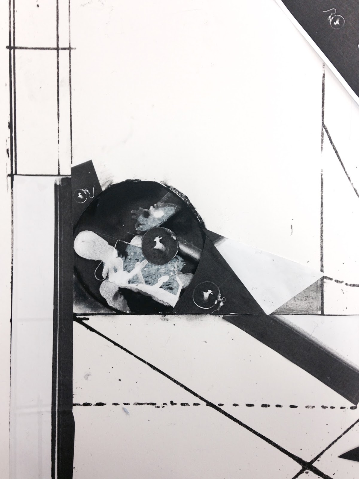
Today I was given an abstract pattern to work with, I decided to photocopy my Photography prints and stick them according to the pattern. I did not use any colour as it did not look effective with my prints. Because the lines were already quite abstract, I followed with this as I stuck my prints down. To continue with the abstraction I cut up a few prints into squares and scattered them evenly. 
I think with the time I was given, this piece is interesting but I do think that it may be too busy. I was given a list of doing words that would help construct my piece and give me some guidance. 


Tuesday, 8 September 2015

FOUNDATION ART AND DESIGN -- FASHION AND TEXTILES

FASHION AND TEXTILES


My first lesson I needed to focus on patterns from a specific object. I chose my stone because there were interesting lines and colours. I first did a realistic interpretation using coloured pencils and a sketch pencil. I then cut this drawing into thin strips, separated them and stuck onto white paper. I needed the patterns and colours to stand out more, so I used cotton threads that were similar colours to the drawing.

Separating the threads gave the pattern more depth and structure. I think so far, this looks contemporary, simplistic but with a bit more thread this pattern could look more effective.


FOUNDATION ART AND DESIGN -- 3D ART AND DESIGN

3D ART AND DESIGN --

My assignment was to create a three-dimensional piece of our objects in a "cubism" outcome. This was huge challenge because I have not done this before and trying to convert something realistic into a cubism form was difficult. 
After practising and failing and continuing to do this. i found I started to form an abstract object. I chose four objects which I thought could merge into something geometric. 
I think what I have created, after many trials, was successful. This cubism form was then drawn to illustrate the different shadows and dimensions. 
I need to work on my sketches and how shadows need to be the strengths in order to make the drawing more three-dimensional. 


FOUNDATION ART AND DESIGN -- PHOTOGRAPHY

PHOTOGRAPHY --

Our first Photography was started off in the dark room, doing basic prints and exposures of our objects. I have done this previously, so it was not too much of a challenge but it is not one of my strengths. I wanted my prints to look abstract and minimal, so for my first print I put my small boxes against one another and exposed the light for 5 seconds. After putting the exposed photo paper in the fixer I realised It wasn't focused but it was quite an effective image all-in-all.
I continued doing this till I found it quite tedious, so i moved on by exposing only the objects. My objects are very simple and not too much transparency so they looked quite two-dimensional when printed on the photo paper. Again I struggled to be adventurous and the outcome of my prints were too simple and boring.


FOUNDATION ART AND DESIGN /STROUD COLLEGE -- ILLUSTRATION.

Foundation Art and Design will be the opportunity to explore each subject in depth to understand where my strengths and weakness are.

Today the Foundation Class where split into six groups (A,B,C,D,E,F). I am in group C which means I started my first day being introduced to illustration because our tutor specifies in this subject.

ILLUSTRATION --

When i think of Illustration I see myself drawing headings or characters for books but today we were instructed to choose a drawing or an experimental piece in our sketchbooks of our summer work and expand this piece further onto an A1 paper.
Expanding a drawing further and enlarging this was quite a challenge because there was no specific starting point or outline to start from. But I decided to stay in my comfort zone first and use charcoal to create line and texture from the table underneath.

As a group we chose an illustration of a feather. This was slightly harder because it was very confined but once we all started to take the lines further off the page it became much easier.
Charcoal is a very 'messy' medium but i thought it would give the image more strength.

After looking at the final outcome, I find my drawing (in the right hand corner) too "tight" and almost too compacted. I like the texture I got from the table underneath the paper but if I focused on this texture a bit more by adding colour or defining the circles in the texture I think as whole this piece would of looked more effective.

What I have learnt in this illustration so far, is that you do need to have a very open-mind and free imagination. This is a challenge for me and may be a challenge I need to work on more.

Our next assignment was to put our objects into three categories ( Man-made, Neutral and Natural). We were then told to choose one the categories to sit at and organise the objects from smallest to biggest. I chose to sit at the man-made category because they were quite graphical and minimal.


I wanted to choose objects that would have an interesting perception and quite simple shapes. After choosing a section of the objects I found I these object (in the image below) i thought this would look quite fun and unique to illustrate. I started by doing a quick sketch with a pencil and then outline it with charcoal. But as soon as I used the charcoal it smudged and did not make the drawing effective. It wasn't what I envisioned, I think i used the wrong mediums and the proportions weren't accurate because I was rushing and not taking the time I needed. I think what would of helped was to stop and study my illustration from a distance to see what I needed. I think my idea would of been effective but the outcome on the paper was not successful. If I added more blocks of colour in areas I think it would of brought the whole sketch together. 

Again, I was out of my comfort and too focused on planning rather than being spontaneous.